Wednesday, April 10, 2024

Project Components

This is my final portfolio project with all three components. I am really proud of what I have done, especially since I consider this the best project I have ever worked on and created. If I could go back in time, would I change anything? Maybe yes, but nothing too major. Maybe a little something here and there, but overall, in my eyes this project is nearly perfect. I hope you guys enjoy these components as much as I enjoyed making them!


My Video Component


My Digital Component - Instagram


My Print Component - Magazine Spread


In case the link does not work:

Print Component Embedded:


Critical Reflection

        Animals have been around for over 500 million years and ever since our coexistence with them, humans have learned to work and thrive together in various ways. Long ago, we used animals as food or travel; however, this evolved in the mid-1900s to use animals for comfort and security, including therapy and search-and-rescue dogs. The recent utilization of K9 dogs and normal dogs has significantly enhanced public safety and well-being through their vital contribution to society.

        To create my documentary about the role of K9 dogs in the lives of humans, I had to research certain other documentaries to be able to understand the typical conventions. Through my research, I learned more about how these non-fiction storytelling pieces are made to inform and entertain the viewers through real-life events. A very large difference between documentaries and other genres is B-roll and interviews. This is because the interviews allow for a sincere-sounding story and real-life experiences. Although I did use interviews and B-roll to convey my message about animals, I didn't use any staged B-roll. All of my B-roll came from videoing events that were already happening to be able to express the sincerity and reality of the job the dogs play.

        'Abstract: The Art of Design' is one of my references for my project because of the largely artistic and un-storylike feeling to it. Unlike the other two documentaries I watched, this one didn't follow a direct storyline; instead, it created a main focus and laid examples and mini-stories around that main idea. For instance, I learned a lot from the costume-designing episode, featuring Ruth Carter, because of how many new techniques and conventions I learned. This episode not only broadened my perspective but also demonstrated the vitality of B-roll in documentaries.

        Apart from the documentary I watched, I also researched online the topic of coloring. A large part of my brand is the color schemes that I've picked and stuck to for my 3 components, but I will talk more about that later. I researched different pet shows and movies to see the kind of approaches each one took with coloring. During this research, I saw a pattern of warmer colors. This inspired me to theme my own project similarly.

        The branding of my portfolio project consists of three components all connected by a warm and calming color scheme. Within my brand, I constantly express the main message: the importance of taking care of animals and showing them love. These two characteristics make up a large part of how I plan to connect to my target audience of females aged 15-25 who want or have pets (more info about my target audience here). The print component uses my interview to express the idea of equal treatment and care for all animals. The digital component uses quotes, pet holidays, and archived footage to highlight cruelty and hatred towards animals. Lastly, the video component allows the subjects to express their true feelings about animals, bringing to light the sympatric relationship between humans and animals. That is why the mutual bond between our humans and animals should be respected greatly.

        I established that my target audience is mainly females aged 15-25 who want or have pets in a past blog. So, apart from the already attractive colors, I have also used many cute or eye-catching thumbnails and posts in my Instagram account and my magazine spread. For example, in my print component, I use colorful yet calming pictures that show variation from my documentary. The large quote I added also draws attention. I meticulously picked this quote from within my piece to make my readers want to learn more about this piece and what it has to offer. This would also engage people to want to read the rest of the magazine.

        On the other hand, I used interactive content on my Instagram page, along with cute and engaging thumbnails of postings, to connect further with my audience. These included both an animal of the week posting and a Q&A of the documentary before it was released. Another large thing I do within my postings on Instagram is add long captions that alert the readers to "stay tuned" or "keep an eye out" for something. This makes my audience want to stay and learn more about what this documentary really means. Lastly, I also use joyful yet calming tunes in my video component to add a more comforting mood.

        The main issue my documentary tries to present is animal abuse or neglect. As I mentioned earlier, all of my components have a combined secret message of 'all animals should be respected and cared for.' One way I expose this message is through some of my Instagram posts. So far, I have made two postings about actual stray animals and I've explained in the caption the importance of at least respecting these animals.

        Something else I did a week ago, was post a picture with a long caption for 'National Pet First Aid Awareness Month.' In this caption, seen below, I obviously talk about the first aid information; however, I also mention and stress the importance of taking care of your animals and pets as much as they take care of us.

        The last way that I clearly state my stance on this social issue, is within my print component. In my interview, I make sure to portray the idea that all animals should be thought highly of, not only the ones with specific jobs in the world. However, I would have liked to have included more representation within my actual video component. Since all of the talking and narration over the B-roll is done by the subjects, I didn't want to tell them what they should or should not say about this tough and important topic. Therefore, many of their responses didn't cover the topic of care for animals themselves. Overall, though, I think I accomplished my objective of bringing attention to this social issue within the three components of this project,

Tuesday, April 9, 2024

Making my Critical Reflection

Today I made my critical reflection. This is the last step of my project. It is basically where I self-reflect on my whole process and see anything that I would've changed or I would've kept. So, I will be dedicating this blog to talking about my process of making it. Sadly, this will be a short blog because the writing of my CR was mainly just spurring out information. Anyway, let's get into it.

        Way back in December, when I made my first documentary project, my teacher made us do a smaller version of critical reflection for that project as well. We also had a lesson where we learned about it, and my notes are shown below (sorry if it's a bit messy, I didn't plan on sharing it with anyone). 


        You can see in the picture the four main questions of the critical reflection that I had to answer. Before anything, I took the questions and the outline bullets below them and basically filled them out for my own project. Almost like creating an in-depth outline for my 1000-word essay. I AM SO SAD BUT AS I WAS MAKING THE ESSAY I WAS DELETING THEM SO I HAVE NO PROOF OF MY OUTLINE! :( Anyway, after my outline was done, I decided to start writing. Something I did do though, was I answered question 3 before question 2. I know you can answer them in any order but I almost felt like I was doing something wrong. Anyway, the reason I did that was because I thought the topic I was talking about in question 3 was almost like a direct path into question 2.

        Next, I wrote my essay. I did it in fragments, so whenever I thought of something good I would add it, and when I didn't, I would sit there for some time until something worthy came into my mind. This took me about 3 hours to write in total, due to my frequent pauses and breaks in between my actual typing; however, I took around 4 hours to do everything because I had to go back and edit some paragraphs. After all, they were too messy and didn't flow well together.

        Another thing that happened was the word count. While I was making my outline for all of the questions, I started getting so many ideas for question 3 already, specifically the part about 'How (or not) do all 3 components work to develop your brand.' I don't exactly know how it happened, but I started writing and writing and made a chunky paragraph within 30ish minutes. It was over 250 words and it wasn't even the whole third question. I got a little nervous but decided to start ACTUALLY writing the essay and come back to it later.
        At the end of everything my essay was at around 1180 words which I thought was too much over. On the one I did in December, I got around 1040 words and I decided that would work fine; however, 180 words over the amount I should've done wasn't very good. So, I went back to that chunky paragraph and I knocked it down to only 161 words. After that, I finally went through everything and took out any filler words or sentences and anything I thought wasn't exactly necessary.

        Anyway, thank you for reading my blog about the making of my critical reflection and I hope you enjoy my full project in its totality. 

- Dana

Saturday, April 6, 2024

Printing Done!

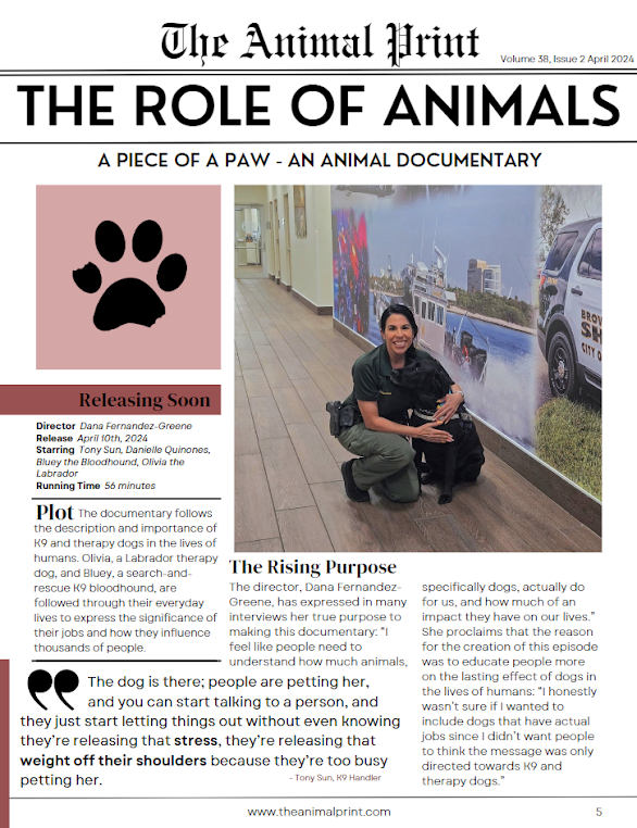
 I finished my print component finally! I'm actually super proud of it. I know most of the part I'm proud of is all because of the template I found, but I still really really really like how it ended up. Anyway, I'm going to do the same format as the last posting, where I put one picture at the beginning and then explain all the different sections of it below.

        Starting off, I did the text. I started by looking at my two references from my print component post, and the first thing I saw in both of them was a little drop-down of facts about the movie including screening time, director, starring release date, and more. I decided to do that but use the ones that matched the most with my documentary instead of just using any random ones. For example, as I included the director, it wouldn't be necessary to include the writer, costume designer, producer, and all of the others because all of them would just be me. Anyway, this little explanation and little facts about my piece help with the distribution of it. Basically, it would have helped people know when it would get released and who was in it and made it.

        Next, both of my samples also included little sections with background or plot paragraphs where they briefly explained the plot of the film, so the viewer could further understand the topic of what the magazine was going to be talked about. This also allowed me to brief people since this magazine would have been released before the release date of my documentary episode. Not only would it help readers understand the rest of the magazine spread, but it would also let people get to know my film and wonder whether they would be interested in it or not. As seen at the very top, the whole magazine is pet and animal-themed, meaning that many people reading this would probably be interested and entertained by my upcoming episode.

        After this, I decided to create a section for the purpose. I think that a large part of my brand that I want to express throughout all of my mediums, is the idea of the importance of acknowledging an animal's importance in the lives of humans. This section was perfect for me to express that. This is also where I began to form a tone and form of expression that I was going to continue onto the rest of my magazine as well as the second page. This tone I created was one of worry yet confidence. Basically, I wanted the director, or me, to seem like they wanted to let the readers know that the purpose wasn't to show the importance of service animals and therapy dogs. Instead, it was to ease the idea of the importance of every single animal no matter the job they have in their life. I continued this mood throughout my piece as well.

        The last piece of text I wrote, was a short interview. I wanted to use this interview to not only introduce myself as a person into my brand but also help touch on the most important parts of the purpose that I wanted to portray. All I did here honestly was spew my own mind about the topic. While I was writing it, it almost didn't feel like an assignment because of how much I agreed with my director personas thoughts.

        The very last thing I did, was add in the pictures. Like I said in my last blog, I decided to simply add pictures I used on my Instagram or on my blog. I also decided to add my logo at the top, to connect the whole magazine with my brand. This would allow people to recognize that logo and remember it whenever they see it on social media or on other mediums. I also decided to add a picture of myself because the whole second page is about me answering questions, so I thought adding some personality and a face behind the responses would allow people to understand and reason with my brand more. This would also help me gain a greater audience for my actual documentary episode.

-Dana

Friday, April 5, 2024

Intro to my Print Component

Today I started with the print component of my piece: the 2-page magazine spread. I still need to finish the piece, however, I have started it and plan to finish it soon. So, I will document what I have done so far and what my plans are in terms of finishing it. Before I start, I'm going to say that I'm putting one picture at the beginning of this blog to show my progress and then I'm going to talk about the different aspects of it.


        As I mentioned in my previous blog, I have already picked a template for both pages. I got them from 2 different sources on Canva, so the vibes and formatting of each one were originally, and still are a little different from one another. This made me have to make certain things match each other like the link and page numbers at the bottom, the indentation, the font, and the overall formatting of the pictures and text. 

        Like I just mentioned, that closely relates to the title I picked above, I made sure to edit and enter a new title and make up a link for the section on the bottom. I started with the fancy font section on the first page at the very top. I didn't really know what to put there until the title "The Animal Print" popped into my head. I actually am in love with that title and how the play on words doesn't only vaguely match my own piece, but also matches the medium this magazine spread/article would be released on. If I haven't mentioned it enough, I love play-on-words and phrases!

        To connect this to the other page as well, I decided to copy the little bottom section from the first page, which includes the link and the page number, and place it onto my other magazine page as well. This not only would help the two pages be more cohesive, but it would include a nice little touch and have a fitting place for the page number without seeming like it was placed in the middle of nowhere. This is also where I decided to simply copy the title that I chose above and place it into the link to make a fake, but cute and matching link to the made-up magazine.

        Going from the top down, the next section is the little bit of text to the title of the magazine on the first page. In case you can't see it, it reads, "Volume 38, Issue 2 April 2024." This subtext helps me relate it to the topic I want to connect my whole magazine spread to a critiquer that gives an early viewing of the documentary. This idea came from the many examples I saw and researched in my magazine spread blog posting when I first learned about my print component here.

        Next, the title "The Role of Animals" would be the title of this specific magazine packet. This also allows me to further hone in on my actual topic and how it relates to my documentary piece. Using the topic relating to the role of animals in human lives not only closely relates to the topic of my therapy and K9 dog documentary, but it also helps viewers and the readers of the magazine to see more content on the same topic and learn more about that topic on a wider scale.

        The subheading "A Piece of a Paw - An Animal Documentary" allows people to not only immediately see the title of my piece, but also get a little insight into the genre and vague format of the way I express my information through the piece.

        The next thing I want to talk about is the quote. I mentioned this topic in the blog about the introduction to my print component as well. I don't know why but every time I read any type of magazine or newspaper, my eyes always dash straight towards any quotes on the page that are bolded or made bigger to bring attention. Obviously, that's the point of making the quotes stand out on the page, but since I've had that personal view of them, I decided to add them to my own magazine.

        At first, I was going to add the quote "Most people say... animals are better than humans." This is actually the first line of my documentary; however, after a bit, I decided not to add that specific one since it was a little short for my taste and I wanted something longer and something that has a more lasting expression on someone. So, I decided to pick the quote that I did: "The dog is there; people are petting her, and you can start talking to a person, and they just start letting things out without even knowing they're releasing that stress, they're releasing that weight off their shoulders because they're too busy petting her." I feel like this quote really represents my piece in its entirety. It relates dogs with calming and how therapy dogs do their jobs by comforting and allowing people to destress.

        Lastly, all I believe I have left is the actual text and the pictures (which I will probably use similar to my Instagram and the ones I use on here). I have a little bit of an outline of what I'm going to answer and use to write my text:

-A critique of my documentary from someone who saw it before it aired and was impressed by it.

-Talk about how it's influenced their lives and their perspectives on therapy and K9 dogs.

-How the documentary is for the greater good of the world.


-Dana
Tuesday, April 2, 2024

Group Meeting #2

Today, I had my second and final group meeting in class. I'm confident I already talked about the importance of group meetings in my last posting, so I will briefly explain why this specific meeting was so important. 

        Unlike the prior meeting, this one was more personalized to our actual projects as most of our group members had almost all of their projects done. This helped me especially because almost everyone in my group was doing a documentary, so we were all on the same path and having to do the same aspects of the project. So, this helped me understand and realize what page of the project other people were on, so I could know what I may need to do to be able to finish my project adequately on time.

        The first thing we talked about was surprisingly our print component. My print component, like I mentioned in this blog, is a 2-page magazine spread. My group and I talked about different formats and ideas people were doing, and everyone who had theirs already done or almost done said that they made the text of the article first and then assembled it into a Canva or Word format/design. This helped them speed up the process since the difficult section was already mainly over with. 

        While talking about this, I decided to browse Canva for some templates and I found 2 that I liked that I'm going to match their styles and make each one of my two pages.

        Another small thing one person in my group mentioned was to add pictures of my final product (when submitting) and potentially add a link in case the text gets hard to read through blurriness or the size of it.

        Apart from my print component, my group and I also largely discussed the digital component: my social media page. I think one of my biggest issues with this project at the moment, is the amount of content or the lack of knowledge about what exactly to post on my Instagram account. I've already posted several posts about introducing the dogs and the K9 Handler subjects, so I feel it to be useless to do it again.

        Someone in my group made a very strong point and idea that everyone could use differently. A poll or a questionnaire. I remember when learning about the social media page, my teacher told me that being interactive with your audience is almost the best thing you could do. So, apart from already having my pet of the week, I decided to add a Q&A where I will be asking my own questions and answering them to tell more about what my project is about. This can also be made into a highlight so it stays on my account page forever.

        We also talked in my group about the actual filming project, although not that much, and I remembered the important details about archived footage again. This actually saved me because I had to go back in and change the accidentally archived footage I used. Sadly, I couldn't actually show my groupmates my project, because since I was still making finishing touches, I hadn't exported it off of Adobe Premiere at that point yet.


        Lastly, I FINALLY MADE MY LOGO! I don't know why I've been putting this off for so long, especially since looking at my plain Instagram logo was appalling, but I finally made one. I went for the simplistic approach, but I made it in a way that closely connects with my title, and I really love it a lot.

-Dana


Saturday, March 30, 2024

Video Done!

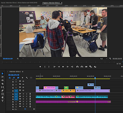
Okay, maybe the title is a little misleading. Technically, my video component is completely done; however, I still plan on receiving feedback and going back to change some things. Overall though, I basically finished editing today, and I'm dedicating this blog to my process of this final post-production stage.

Similarly to my last blog posting, I'm going to be making sections and placing what I did in order, so it makes more sense for you guys.

Organize:

        The first thing I did today, was organize my piece. In my last blog, I talked about how organizing the order of the interview clips and intertwining the two interviews was the next task on my plate. So, I began organizing. I didn't have a lot of time to edit yesterday, so while I began to edit yesterday, I simply organized the first minute or so and added the matching B-roll right away. Typically, I would have waited until after organizing everything to add a B-roll, but I wanted to have at least one section completed before going to bed.

- - - - - - - - - - - - - - - - - - - - - - - - - - - - - - - - - - - - - - - -
        Something else I did yesterday that would help me today is make bins. I had done this in several past projects, but since I had such a grand variety of visual and auditory footage, I decided to implement it into this project as well. If you're not familiar with Adobe Premiere Pro or bins in general, they are basically little folders you can create within the imported content that can help you organize more specifically your content. Below, you can see all of the folders I created to help me organize and be able to locate my content quicker and more efficiently.

        One thing you might find strange from the list of bins above is one called 'USED.' This was surprisingly my most important bin, in my opinion. One big problem I had while editing my in-class documentary project, was that I would accidentally use the same clip of B-roll twice, and not even realize it until way later. In order to solve this problem, I made this bin. Every time I used a new clip, whatever it may be, I took it out of its corresponding bin and put it into the 'USED' bin so I made sure to not re-use it.

- - - - - - - - - - - - - - - - - - - - - - - - - - - - - - - - - - - - - - - -

        Anyway, today in the morning, I started editing again, and I simply spent some time organizing the interviewee clips in an order that I thought was good. This was a little complicated because although they both had the same questions being asked, both interviewees typically responded to the questions in unique ways. This obviously provided me with a greater variety of content, but at the same time, it made it hard for me to match up the content with one another and make the whole piece flow smoothly. So, after some time of deleting clips and rearranging them around, I finished the organizing stage of this post-production process and decided to move along.

Music:
        Surprisingly, I decided the next step I wanted to take was music. Music has always been hard to choose from due to the vast amount of options available through the infinite platforms online. The only problem was that the only idea I had for what I wanted the music to sound like was light-hearted and calm. Obviously, this very vague description didn't help me, especially with my very picky eye. I ended up scrolling through YouTube for about 45 minutes before giving up and taking a break. A while later, I told myself that no matter how much I delay it, I'm going to have to find a good music backtrack at some point, so I might as well get it over with. Around 30 minutes after fooling around some more on YouTube, I found one sound that I thought was decent. It didn't wow me at first, but I was so exhausted from scrolling through the search results on YouTube that I decided to save the sound just in case.

I'll get back to when I placed it into my project in a bit.

B-roll:

        This section title is probably pretty self-explanatory. This is the long process of re-watching my piece and my interviewees over and over again until I find a good enough B-roll piece that fits the vibe and feeling that certain sections of the interview match. There isn't much to say about this process since it's mainly trial and error, so I'll just add some pictures of the B-roll I added and I'll move on.


Back To Music:

        At this point, I had added the music to my piece (the long magenta soundtrack at the bottom of my editing clips above). When I first heard it matched up with my wholesome piece, I thought it was so cute and that it matched pretty well. That was until I heard the song fade out in one certain part where coincidentally, the interviewee also stopped talking for a second. After this, the song faded back in and started playing a new tune at the same time that the interviewee started talking again. This was when I realized that this sound could not have been more perfect. It almost felt like it was meant for my piece.

- - - - - - - - - - - - - - - - - - - - - - - - - - - - - - - - - - - - - - - -

Anyway, after that, I added my finishing touches and labeled my video component as done without counting any last-minute changes I may have to make after critiques from my friends, family, or maybe even my teacher.

-Dana

Project Components

This is my final portfolio project with all three components. I am really proud of what I have done, especially since I consider this the be...