This blog will be dedicated to the print component of my piece. For my documentary, I have to do a 2-page magazine spread. We had a lesson today in class and overall learned some important components/necessities and topics we should attempt to focus on in our article.
- - - - - - - - - - - - - - - - - - - - - - - - - - - - - - - - - - - - - - - - - - - - - - - - - -
Before diving into any specific examples, I'm going to vaguely go over the notes we took in class, so you have an idea of what we learned and what I'm looking to do with my print component.
Recommended Topics:
-Behind the Scenes (Production)
-Interview with Director (Cast/People)
-Content Focus (Topic)
Important to Remember:
-Page Numbers
-Photographs directly relating to the content (staged)
-2 to 3 columns on each page
-Left Aligned
-Engaging Images
-Byline (who wrote it)
- - - - - - - - - - - - - - - - - - - - - - - - - - - - - - - - - - - - - - - - - - - - - - - - - - - - - - - - - -
Example 1: Spider-Man 2
This magazine page is very focused on the movie itself and how the writer perceives it. The article took the topic focus direction by offering critiques and positive comments about how they felt about the movie. I really like this approach since I can simply critique my own project and use content that I would be able to use for my critical reflection; however, I also think this might be a lazier approach, so I might not rely on the topic focus idea.
Apart from the actual content of the magazine, I absolutely love the layout. Normally, using a whole page and a quarter for a picture would be excessive, but I actually really like how it looks and there is still plenty of text on the other side of the magazine. From what I can see, the magazine spread holds almost all of the needed characteristics, which makes it a very good example to rely on and base my own on. I really like that they used the same blue color in different sections of the 2 pages to connect the same color scheme.
This Spiderman magazine spread uses several characteristics typically seen in this type of medium. This includes the page numbers, title, byline, and the columns. The biggest and one of the most important aspects (in my opinion) of the magazine is the picture. The size of the picture already shows the importance of it and the role that it is supposed to play in the audience. Additionally, the way it is framed and shown enforces that message even more. Typically, pictures are used as a stylistic choice and to lure in te audience to want to know more about the piece.
This picture, however, uses the very well-known character, Spider-Man, to convey an idea of the overlying topic of the article to the target audience immediately. The only thing is that since Spider-Man is such a well-known and popular character, this technique works just how it was meant to work. On the other hand, using it on a character, show, or movie that doesn't have a large franchise would not work the same way. So, even though I won't be able to use the same technique, I still plan to add engaging images to attract a larger audience. One more thing I wouldn't follow is how small the text is. I almost feel like I can't see it, and the fact that the picture is over the half-life and division of the 2 pages further limits the amount of information and the ability to easily read all of the text.
- - - - - - - - - - - - - - - - - - - - - - - - - - - - - - - - - - - - - - - - - - - - - - - - - - - - - - - - - - -
Example 2: Wreck-It Ralph
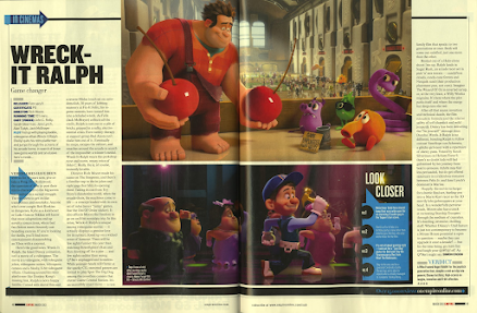
Similarly to the other magazine's 2-page spread, this one is also a review. It talks about different techniques and aspects the writer liked about the movie and also certain things that stood out to them compared to other movies. Reading more into the text, you can see that the main focus of the article is to show the differing and special aspects of this film, making it a clear advertising technique. It also appears that this was made before the movie came out, making this more probable a marketing idea. Additionally, it also includes text of the cast and the release date which is a necessary factor to inform the reader enough to get information on the upcoming film.
The 2 large pictures placed in the middle of the 2-page spread also attract attention from a larger audience due to the bright colors, size, and the well-known Disney animation art style. Apart from that the coloration of the rest of the page fits in by making the outside seem dull but making the pictures eye-catching. Again, this magazine article follows typical magazine characteristics such as page numbers, engaging pictures, columns, and other aspects that help bring the whole article together. Overall, every aspect of this magazine's spread helps focus on the advertising of the movie.
- - - - - - - - - - - - - - - - - - - - - - - - - - - - - - - - - - - - - - - - - - - - - - - - - - - - - - - - - -
Last Fact
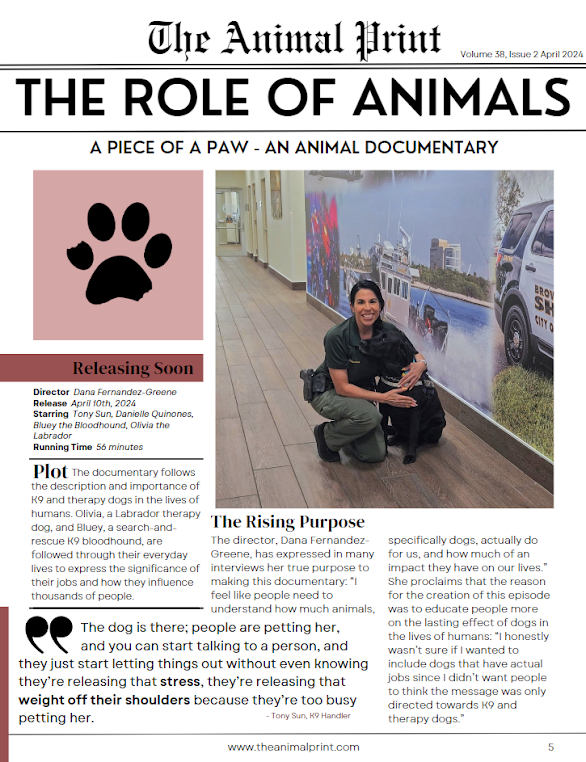
While researching for good magazine examples, I came across a couple that had quotes built in like in the picture on the right. I also saw this technique in one of the examples my teacher showed in class. I don't know why but this technique really caught my attention. Something about the different text sizes and the break in the columns helps the whole piece look so much more soothing. Anyway, I really like how it looks and I will try my best to include one in my own magazine spread.
Thank you for reading!
-Dana


No comments:
Post a Comment